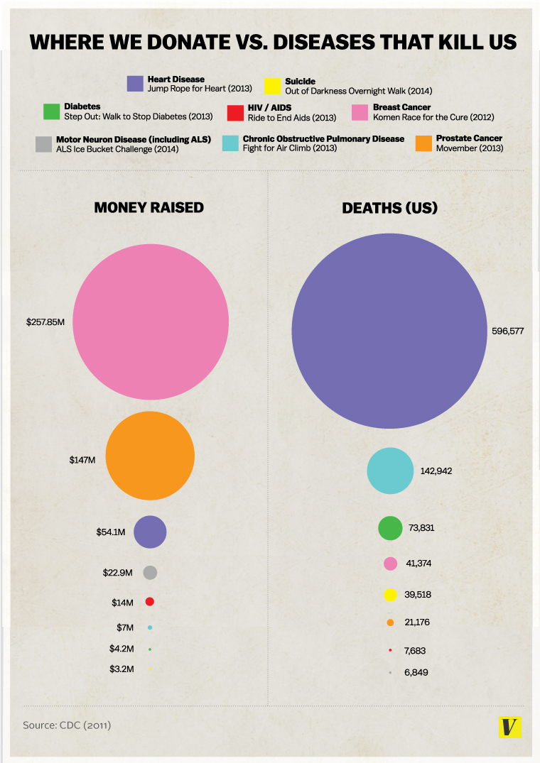
An infographic has been making the rounds lately, purporting to depict the amount of money donated to help fight various diseases versus the number of actual deaths caused by each disease. This is the original infographic:

An infographic has been making the rounds lately, purporting to depict the amount of money donated to help fight various diseases versus the number of actual deaths caused by each disease. This is the original infographic:
